Chapter 6 reading
Today I read in chapter six about different case studies by Kim Baer. This chapter basically takes you through the outline of these case studies. I thought they were great examples and I think they even helped me change my mind frame on the way I would go about doing one myself. Some case studies were also obvious just because I have been taught these practices for a while now, I always like to see the process behind a creation to see where someone started and ended up, some of these case studies did great at showing this. I think one thing that I will bring away from this is its important to write down all your ideas even the dumb ones and to draw and draw often.
some related links
http://www.ideabook.com/tutorials/logo_design/stepbystep_logo.html
another really cool link dealing with process and drawing
http://imjustcreative.com/apple-eve-logo-process/2010/06/12/
Wednesday, October 24, 2012

Wednesday, October 17, 2012
A Design Toolkit Consists....
Color
Type Styling
Weight and Scale
Structure
Grouping
Graphic Elements
Imagery
Sound and Motion
All of these things help to guide a user and all of it is intentionally thought out. Color helps with isolating elements, directing the eye to a given location, and hierarchy.
Type styling is another method of providing hierarchy you could do this by highlighting, bold font of playing with different typefaces to clarify varied types of content in a book that is very text heavy. Even things like boldfaced content headers help readers quickly find what they need without having to sort through all the fine detail.
Weight and Scale its all about patterns and as humans we are subconsciously looking for them after reading a word long enough we recognize a pattern and then when we see it we no longer sound it out or actually read it we already know what it is though a recognition process. Thats why sometimes changing these patterns like using all caps can confuse the user and slow down the experience because the design is unrecognizable. Changes in scale and weight can show the importance of certain things compared to others.
Structure deals with the grid. Using a grid and capitalizing on white space can help the user navigate through complex information, it keeps things organized, and can also create a since of importance/hierarchy.
Grouping is another way of organizing information so that it helps users quickly locate what they are seeking, it can help show importance, create hierarchy, and maximize readability and coherence.
Graphic elements are things like lines, rules, and bullets which are things that designers use to attract the eye (good for showing direction). It can also show attention to detail, give it a since of time, and create visual interest.
Imagery is a powerful component, it is said that putting images together with words is one of the most powerful ways in having the user retain the information that they have read. You go out of the way to read text if you are interested in a subject, or you are required to do so for a school subject, but only imagery can stop you and make you read something you never intentionally wanted to read just because a photo intrigued you to read it.
Sound and Motion is the last thing that is combined with these tools to convey a clear design message it is another wat to help the user retain information, it is a way of learning something twice, and really allowing the information to sink in, you are hearing it and seeing it at the same time.
Color
Type Styling
Weight and Scale
Structure
Grouping
Graphic Elements
Imagery
Sound and Motion
All of these things help to guide a user and all of it is intentionally thought out. Color helps with isolating elements, directing the eye to a given location, and hierarchy.
Type styling is another method of providing hierarchy you could do this by highlighting, bold font of playing with different typefaces to clarify varied types of content in a book that is very text heavy. Even things like boldfaced content headers help readers quickly find what they need without having to sort through all the fine detail.
Weight and Scale its all about patterns and as humans we are subconsciously looking for them after reading a word long enough we recognize a pattern and then when we see it we no longer sound it out or actually read it we already know what it is though a recognition process. Thats why sometimes changing these patterns like using all caps can confuse the user and slow down the experience because the design is unrecognizable. Changes in scale and weight can show the importance of certain things compared to others.
Structure deals with the grid. Using a grid and capitalizing on white space can help the user navigate through complex information, it keeps things organized, and can also create a since of importance/hierarchy.
Grouping is another way of organizing information so that it helps users quickly locate what they are seeking, it can help show importance, create hierarchy, and maximize readability and coherence.
Graphic elements are things like lines, rules, and bullets which are things that designers use to attract the eye (good for showing direction). It can also show attention to detail, give it a since of time, and create visual interest.
Imagery is a powerful component, it is said that putting images together with words is one of the most powerful ways in having the user retain the information that they have read. You go out of the way to read text if you are interested in a subject, or you are required to do so for a school subject, but only imagery can stop you and make you read something you never intentionally wanted to read just because a photo intrigued you to read it.
Sound and Motion is the last thing that is combined with these tools to convey a clear design message it is another wat to help the user retain information, it is a way of learning something twice, and really allowing the information to sink in, you are hearing it and seeing it at the same time.
Wednesday, October 10, 2012
Project 1 Project Statement
Background-
I will be creating an info-graphic that shows and talks about different types of meat cuts on the most typically ordered meat in the US (beef, pork, lamb), their nutritional information, and where they are located on the animal. The client is Rain Shadow Meats a small local butcher store in the heart of downtown Seattle. The butcher store prides themselves in friendly service, quality meats, and a nod towards being local, organic and sustainable. The stores mission is to have the customer have the best experience possible they hope to do this by having an info graphic on meat cuts to help educate their customers on different meat choices before their final purchase.
Target Audience
Anyone that wants to know where there meat is coming from, and wants to better educated themselves on the nutritional value of each cut. Health critics, shoppers, cooks,ect.
Objectives
The objective is for the user to be more educated and to better understand the meat that they are about to be ingesting into their bodies. Where it is located,nutritional value, and where it probably came from.
Obstacles
The main obstacles will probably be language barriers, I will need to make sure my images speak for themselves, my diagram will also not include all meat things like chicken that don't have cuts wont be included and so people that want nutritional information on that with have to go somewhere else to find it.
Key Benefits
People will gain a better understanding on the meat they are eating, and possible choose healthier choices.
Support Statement
The benefits of creating this info graphic out weight the obstacles, because it is giving people information, if they don't understand it because of language barriers, they don't understand it and there is no harm done, however people that do understand it will be better informed and more knowledgeable because of it.
Tone
Light and educational tone.
Media
This will be on posters put up at chain supermarkets in the meat section where people purchase there cuts. It could also be on the web for those people that just want to educate themselves on meat cuts.
Creative considerations
The design of the info-graphic will hopefully be able to speak for itself but if it doesn't clarifications will only be in English. For the web there will be additional information because of the ability to hover, and click.
I will be creating an info-graphic that shows and talks about different types of meat cuts on the most typically ordered meat in the US (beef, pork, lamb), their nutritional information, and where they are located on the animal. The client is Rain Shadow Meats a small local butcher store in the heart of downtown Seattle. The butcher store prides themselves in friendly service, quality meats, and a nod towards being local, organic and sustainable. The stores mission is to have the customer have the best experience possible they hope to do this by having an info graphic on meat cuts to help educate their customers on different meat choices before their final purchase.
Target Audience
Anyone that wants to know where there meat is coming from, and wants to better educated themselves on the nutritional value of each cut. Health critics, shoppers, cooks,ect.
Objectives
The objective is for the user to be more educated and to better understand the meat that they are about to be ingesting into their bodies. Where it is located,nutritional value, and where it probably came from.
Obstacles
The main obstacles will probably be language barriers, I will need to make sure my images speak for themselves, my diagram will also not include all meat things like chicken that don't have cuts wont be included and so people that want nutritional information on that with have to go somewhere else to find it.
Key Benefits
People will gain a better understanding on the meat they are eating, and possible choose healthier choices.
Support Statement
The benefits of creating this info graphic out weight the obstacles, because it is giving people information, if they don't understand it because of language barriers, they don't understand it and there is no harm done, however people that do understand it will be better informed and more knowledgeable because of it.
Tone
Light and educational tone.
Media
This will be on posters put up at chain supermarkets in the meat section where people purchase there cuts. It could also be on the web for those people that just want to educate themselves on meat cuts.
Creative considerations
The design of the info-graphic will hopefully be able to speak for itself but if it doesn't clarifications will only be in English. For the web there will be additional information because of the ability to hover, and click.
project 1 information sources
http://www.mealsforyou.com/cgi-bin/customize?meatcutsTOC.html
http://culinaryarts.about.com/od/meatpoultryseafood/tp/cutsofmeat.htm
http://www.gourmetsleuth.com/Articles/Cooking-Tips--Techniques-642/beef-cuts.aspx
http://food.unl.edu/web/meatproducts/cuts


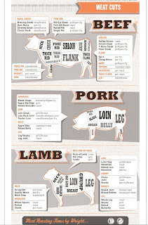


Project 1 inspiration
Concept-
SOme cool infographics that I found to start inspiring me to do my own info graphic.
1.)http://visual.ly/worst-oil-spills-history
2.)http://www.coolinfographics.com/blog/2009/12/16/free-infographic-holiday-cards.html
3.)http://pinterest.com/pin/171207223304673832/
SOme cool infographics that I found to start inspiring me to do my own info graphic.
1.)http://visual.ly/worst-oil-spills-history
2.)http://www.coolinfographics.com/blog/2009/12/16/free-infographic-holiday-cards.html
3.)http://pinterest.com/pin/171207223304673832/
Subscribe to:
Posts (Atom)