
Wednesday, December 12, 2012
extra credit
Wednesday, November 28, 2012
Week 8 reading
This weeks reading we went to the Form of facts and figures site and read patterns on Relation circles, and bubble charts.
The first chart I read was on relation circles which are basically an arrangement of interconnected elements that are placed in a circular shape of equal distance. They are used a lot to show heavy amounts of data that is normally displayed in large lists. Relation circles help to separate description and location of a data element which improves readability through alinement.
http://well-formed-data.net/archives/category/experiments
a cite that shows Relation circles scroll down about four graphs
http://designinginterfaces.com/patterns/radial-table/
The second chart I read about was the bubble chart. Bubble charts are a lot like scatterplots that I talked a little about a few weeks ago. They are a coordinated system that shows correlations between quantitative attributes of two different points. It is displayed three dimensionally and can be used to help visualize social, economical, medical, and other scientific relationships.
https://developers.google.com/chart/interactive/docs/gallery/bubblechart
http://eagereyes.org/criticism/one-chart-to-rule-them-all
Wednesday, November 21, 2012
Chapter Seven Reading
This weeks reading was on Interactive
case studies. The author talks about how they differ from a poster or other
print production because it offers the users more ways of explore the content.
Having a project interactive gives people structure and helps them navigate
though a designated pathway. This works really well if you are working on a
project that has a lot of information and you want to convey it though a series
of steps (you click on something and it brings up more information) this is
basically a way of accommodating multiple entry points. After the author gives
the reason behind the use of having an interactive case study he goes into
talking about the steps on how to get there (from establishing a team, the
objective, the problems, the constraints).
After you establish what your objectives are and how you are going to
get there, you need to make sure the design makes sense. The author quotes David
Lai saying, “ we believe it’s crucial for designers to intimately understand
information architecture. Otherwise they rely on somebody else to think things
through and lose huge opportunities to think innovatively about structure and
navigation.” If you understand the information then you design will make
sense. Do your research and ask people
for input because those are the people you are ultimately trying to teach the
information to.
Wednesday, November 14, 2012
Week 6 Reading and Assingment 3 Proposal
Today we were suppose to to go to the site http://www.niceone.org/infodesignpatterns/index.php5#/patterns.php5 and under patterns there were a huge list of categories about Arcs,Diagrams, maps, and charts. The first section was thematic maps. Thematic maps are a type of chart or mape designed to show a specific theme connected with a specific area.
These maps can portray a variety of things ranging from physical, to social, or any other aspects of a city,
state, or region. An example of what this map can be used for are things like population sizes or to show the spread of a specific diseases.
http://nicksmaps.blogspot.com/2010/07/thematic-maps.html
http://soils.usda.gov/use/thematic/temp_regimes.html
the other type of map we read about were scatterplots. A scatter plot is a mathematical diagram using Coordinates to display values for two types of variable sets. A scatter plot is used when a variable exists that is under the control of the experimenter. so there can be outliers depending on the size of the group...not used very often.
Assingment 3
For Assignment Three I want to have Yahoo be my client I am going to create a a 365 with everyday being a different specific theme that goes off of a old time saying, an example would be, "it's like finding a needle in a hay stack or getting a taste of ones own medicine. These sayings will not be shown instead there will be a picture that describes the saying. This way its like a game you can guess what it is based on the picture and then see if your right. When you slide over the image of the action the saying will appear. it will also give you the background information on where the saying originated and how it became a saying the the first place. Its a game and you learn something at the same time.
Wednesday, November 7, 2012
Reading week 5
In this weeks reading we were to read three different articles talking about info graphics. the first article was 10 Challenges Facing Information Design Today, the second was The Do’s and Don’ts of Infographic Design, and the third was Today In Horrible Infographics: 5 Keys toCreating Successful Infographics.
The first article was interesting it pointed out many problems that information design is dealing with today but at the same time as it was calling attention to these points, it wasn't giving any design strategy on how to fix the over all problem. the author names out the ten challenges that designers face (overproduction, misunderstanding, undervalue, fragmentation, scarcity, Amnesia, Misappropriation, commercialization, commodification, and de humanization). All of these he discusses issues but in no way tries to solve them. I feel like it was an ok read but it was only half written the author apposed questions in my head and left me with no answers.
The second article talks about the DOs and Dont's of info graphic design. The author talks about how design is an ever evolving industry that we need to stay on top of as designers; the only thing that stays consistant is the demand for good design. Although design is ever evolving there is one thing that keeps it on track and that is the dos and dont's of design, the sky is the limit as long as you play by the right rules. An info graphic is a data visualization so you need to show it not tell it, typography needs to play to the beat of your drum, it can make or break a design so it needs to be used in the correct way to send the right message. Organize the storyline make sure it makes sense and has a beginning a middle and an end( you can do this by taking wire frames and thinking outside the box. clear things up with color; the same way typography plays a role in the info graphic so does color. In the ending statement the author says these are just guidelines a way to create a successful info graphics, but it doesn't mean that by not following these rules that you cant create something that is just as effective. I enjoyed this read.
The third article is a lot like the first in which it point of bad things but doesn't combat it with anything good. The author makes fun of an info graphic and says why its bad without ways on how to make it better thus it tells you what not to do but it doesn't say why or how to fix it. This would be considered a horrible critic in any art class.
some articles on infographic material
http://www.smashingmagazine.com/2009/09/11/25-useful-data-visualization-and-infographics-resources/
http://www.smashingapps.com/2011/11/24/34-stunning-infographics-to-understand-the-world-of-social-media.html
http://www.hongkiat.com/blog/50-informative-and-well-designed-infographics/
cool you tube video
http://www.youtube.com/watch?v=AyIMqsX3iH8
Wednesday, October 31, 2012
project 2 project statement
Background
24 hour fitness is looking to increase the sales of membership in the United States of America. The chain as a whole is requesting an info graphic that shows obesity in the united states in corelation to locations where their gyms are. it will also link reasons why nutritionally some states might have a higher obesity rate than others basied on diet, lifestyle, and race.
Target Audiences
Men and women age 16 – 45 or people that care about nutrition and body image.
Objective
To create an info graphic that 24 hour fitness can use to inform / inspire customers to buy a membership.
Obstacles
Many people view themselves as not being the majority so they might just choose to ignore the infographic.
Key Benefit
To Increase money flow to 24 hour fitness along with the increase awareness for customers who are unsure of the benefits of eating healthy and regular exercise.
Support Statements / Reasons Why
To increase business and show the benefits of exercising and eating healthy.
Tone
fun/energetic, clean, sleek, positive
Media
Print (brochure/poster)
Creative Considerations
n/a
In chapter two the author talks about how politics, diplomacy, and
consensus all play a role in whether a design will work or not, it plays the
outcome of design projects and because of this designers started to develop
methodologies that take account for these issues. Developing methodologies
however only works to a certain extent because everyone has a different
meaning to these issues (politics, diplomacy, and consensus) so what it
ultimately comes down to competing departments and what they bring to the table
that creates change in a creative way. The biggest of the three issues are
politics which are all about peoples interests this can be hard because people
with constantly argue amongst each other to define what is of interest to them
materially and organizationally, to help make this a little less difficult the
author goes through steps on how to wrangle an audience and it's content the
first step is to know your audience, then identify and prioritize, and
understanding the requirements (emotional and physical). Another thing that
plays a role is Plain language, which also fits into how you accomplish the
above principles. Writing plan language is not about reformatting and making
your sentences shorter to look better, it’s the process of rethinking the whole
object you trying to represent. What is it you are trying to say, who are you
trying to say it to(target) and what are the reasons. After this the author
goes into talking about the creative briefs and personas and scenarios that
showed so interesting ways on how to do things that I already knew a lot about.
Wednesday, October 24, 2012
I am still trying to figure out ideas on what I think you are looking for I think I want to do something with caffeine and how it effects a big group of people, Divorce rates around the world, health of individuals that links to Nutrition and exercise based on geographical location, or recycling how much people recycle where and how much of that is actually being recycled. those are a few of my ideas but I still need to find the data so my ideas might change. I have also peeked through some inspiration I think these might be examples of things we are looking for that works for this type of info graphic project. telling a story with data....

Chapter 6 reading
Today I read in chapter six about different case studies by Kim Baer. This chapter basically takes you through the outline of these case studies. I thought they were great examples and I think they even helped me change my mind frame on the way I would go about doing one myself. Some case studies were also obvious just because I have been taught these practices for a while now, I always like to see the process behind a creation to see where someone started and ended up, some of these case studies did great at showing this. I think one thing that I will bring away from this is its important to write down all your ideas even the dumb ones and to draw and draw often.
some related links
http://www.ideabook.com/tutorials/logo_design/stepbystep_logo.html
another really cool link dealing with process and drawing
http://imjustcreative.com/apple-eve-logo-process/2010/06/12/
Wednesday, October 17, 2012
A Design Toolkit Consists....
Color
Type Styling
Weight and Scale
Structure
Grouping
Graphic Elements
Imagery
Sound and Motion
All of these things help to guide a user and all of it is intentionally thought out. Color helps with isolating elements, directing the eye to a given location, and hierarchy.
Type styling is another method of providing hierarchy you could do this by highlighting, bold font of playing with different typefaces to clarify varied types of content in a book that is very text heavy. Even things like boldfaced content headers help readers quickly find what they need without having to sort through all the fine detail.
Weight and Scale its all about patterns and as humans we are subconsciously looking for them after reading a word long enough we recognize a pattern and then when we see it we no longer sound it out or actually read it we already know what it is though a recognition process. Thats why sometimes changing these patterns like using all caps can confuse the user and slow down the experience because the design is unrecognizable. Changes in scale and weight can show the importance of certain things compared to others.
Structure deals with the grid. Using a grid and capitalizing on white space can help the user navigate through complex information, it keeps things organized, and can also create a since of importance/hierarchy.
Grouping is another way of organizing information so that it helps users quickly locate what they are seeking, it can help show importance, create hierarchy, and maximize readability and coherence.
Graphic elements are things like lines, rules, and bullets which are things that designers use to attract the eye (good for showing direction). It can also show attention to detail, give it a since of time, and create visual interest.
Imagery is a powerful component, it is said that putting images together with words is one of the most powerful ways in having the user retain the information that they have read. You go out of the way to read text if you are interested in a subject, or you are required to do so for a school subject, but only imagery can stop you and make you read something you never intentionally wanted to read just because a photo intrigued you to read it.
Sound and Motion is the last thing that is combined with these tools to convey a clear design message it is another wat to help the user retain information, it is a way of learning something twice, and really allowing the information to sink in, you are hearing it and seeing it at the same time.
Wednesday, October 10, 2012
Project 1 Project Statement
Background-
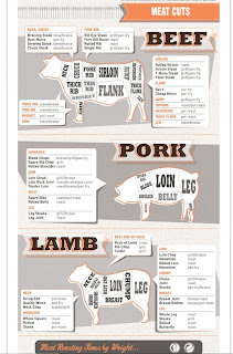
I will be creating an info-graphic that shows and talks about different types of meat cuts on the most typically ordered meat in the US (beef, pork, lamb), their nutritional information, and where they are located on the animal. The client is Rain Shadow Meats a small local butcher store in the heart of downtown Seattle. The butcher store prides themselves in friendly service, quality meats, and a nod towards being local, organic and sustainable. The stores mission is to have the customer have the best experience possible they hope to do this by having an info graphic on meat cuts to help educate their customers on different meat choices before their final purchase.
Target Audience
Anyone that wants to know where there meat is coming from, and wants to better educated themselves on the nutritional value of each cut. Health critics, shoppers, cooks,ect.
Objectives
The objective is for the user to be more educated and to better understand the meat that they are about to be ingesting into their bodies. Where it is located,nutritional value, and where it probably came from.
Obstacles
The main obstacles will probably be language barriers, I will need to make sure my images speak for themselves, my diagram will also not include all meat things like chicken that don't have cuts wont be included and so people that want nutritional information on that with have to go somewhere else to find it.
Key Benefits
People will gain a better understanding on the meat they are eating, and possible choose healthier choices.
Support Statement
The benefits of creating this info graphic out weight the obstacles, because it is giving people information, if they don't understand it because of language barriers, they don't understand it and there is no harm done, however people that do understand it will be better informed and more knowledgeable because of it.
Tone
Light and educational tone.
Media
This will be on posters put up at chain supermarkets in the meat section where people purchase there cuts. It could also be on the web for those people that just want to educate themselves on meat cuts.
Creative considerations
The design of the info-graphic will hopefully be able to speak for itself but if it doesn't clarifications will only be in English. For the web there will be additional information because of the ability to hover, and click.
project 1 information sources
http://www.mealsforyou.com/cgi-bin/customize?meatcutsTOC.html
http://culinaryarts.about.com/od/meatpoultryseafood/tp/cutsofmeat.htm
http://www.gourmetsleuth.com/Articles/Cooking-Tips--Techniques-642/beef-cuts.aspx
http://food.unl.edu/web/meatproducts/cuts


Project 1 inspiration
Concept-
SOme cool infographics that I found to start inspiring me to do my own info graphic.
1.)http://visual.ly/worst-oil-spills-history
2.)http://www.coolinfographics.com/blog/2009/12/16/free-infographic-holiday-cards.html
3.)http://pinterest.com/pin/171207223304673832/
SOme cool infographics that I found to start inspiring me to do my own info graphic.
1.)http://visual.ly/worst-oil-spills-history
2.)http://www.coolinfographics.com/blog/2009/12/16/free-infographic-holiday-cards.html
3.)http://pinterest.com/pin/171207223304673832/
Ideas for info graphic
1.) smoker info graphic on how you look on the inside and outside for male and female over the time that you smoke.
2.) information on the basic wine types and what they pair well with what foods.
3. information on caffeinated drinks showing the best way to get the most caffeine without drinking too much.
4. a diagram. info graphic on identifying beef and pork cuts in location to where they are anatomically and what it is thats on your actual plate.
5. identifying men's facial hair styles and what it says about them.
6. Info graphic on amotocan symbols.
good resources
http://www.uxbooth.com/blog/complete-beginners-guide-to-interaction-design/
http://www.netmagazine.com/features/10-steps-engaging-interactive-user-experience
chapter readings Information design week 1
Design is powerful, it directs us on where to go, sets down rules, and runs our day to day lives. design is implemented in such a way that we have learned to trust it, whether it is wrong or right. Good design leads us to where we need to go but bad design can cause chaos and sometimes lead to death. Design is implemented to be more than just a tool for the eye, if designed right it can clarify, simplify, lead, inspire loyalty, sell millions and save lives.
To be a designer now is great because we have acknowledge design as a useful tool that society has evolved to depend upon. For this reason alone we need to create our design in a way that makes since.
When we design we need to create an experience for the individual that can cut through the clutter and get to the idea at hand and to do this you need to be in the zone. The zone means that you as a designer have a passion for asking questions and learning more, a keen eye for detail, respect for the end users time, and the empathy to imagine what others feel doing these things allows you to have a user-centric mindset, and once you have that you will never see the world the same again. The new world you will be seeing is information design and because it is needed everywhere and is so vast that not a single set of designers can cover it, it is broken down into categories. We have information Information Architecture, Interaction designer, User Experience Designer,Usability research and testing specialist , simplification of forms, and way-finding are just a few. One thing we know is that the more complex the information is the greater the need is for information design process.
The factors that all play a part in information design are writing, editing, graphics and illustration to help insure the effective communication of information.
Information design is ubiquitous, its all around us we see it on the roadway signs as we drive, the map we use to get from place to place, a brochure for a product, websites , and instructions on a prescription bottle are all forms of information design.

 We are hit with thousands of adds a day things we see, read, and hear are coming at us 24/7 which can all of a sudden become information overload so to help with this we design in a way that reduces things to an essential relevant and manageable minimum which creates some extra guidance to help sort through the rebel. RObert E. Horn says it right when he says, " what we need is not more information but the ability to present the right information to the right people at the right time, in the most effective and efficient forms, and that is what information design is.


Wednesday, March 7, 2012
Wednesday, February 29, 2012
Tuesday, February 14, 2012
Kristina Mahoney
Project Statement
Background-
I am creating a type representation of Shell
Silverstein. His whole face will be
created with type, and will be displayed as a poster to promote an upcoming
event in Seattle where he will be reading from pages of his book to children,
along with doing signing. Shell Silverstein is a children’s short story and
poetry author that has written over 25 books designed to entertain and make you
laugh.
Target audience-
His target audience is for little kids but it really reaches
out to all ages. Adults can relate to a lot of his stories from their own
childhood experiences.
Objectives-
My objective is to make the poster look fun and have the on
looker want to attend the event. I want to use a playful type that is somewhat
kid like since he is a childhood author.
I also choose a picture of Shell where he is giving a funny face because
that helps represent what he is about and that is to have fun.
Obstacles-
The biggest obstacle for me will be making the font come
together to create the right dimensions and shades to his face. I feel when you
are creating something that is real it is harder to fake you cant abstract it,
it must be almost exact to be recognizable and that in itself with be the
biggest challenge (making the picture look like him). This is mainly important
because if no one recognizes him they aren’t going to want to go to the event.
Key benefits
I feel that the audience that will receive this poster will
get some insight on the author and find out a little more about what he is
about through the picture choice I am using and the fact that all the words I
will use to make up his face with be that of his poems and short stories so
they will even be able to read some of them if they take the time to look
closely. This will also help in making the poster and author memorable.
Supportive statements:
The key benefits outweigh the obstacles because the
obstacles state that its hard not impossible. Knowing that its obtainable alone
and if executed correctly more people will know about my favorite author and enjoy
him enough to keep the poster.
Tone:
The tone should be fun and light with a comedic type of feel
Media
This with be made wit ha poster but could also be sized down
for a newspaper add or flyer.
Creative considerations
I choose a comedic picture of Shell to represent humor and provide
a light atmosphere. I also choose a font that was kid like and light because he
is a children’s author.
Prepared by Kristi Mahoney
Tuesday, January 31, 2012
famous people that inspire me
 This is my favorite childhood author I spent hours memorizing his poems and short stories when I was younger


 Garth Brooks Ive been listening to him with my dad since I was little I have heard and memorized all his songs and his music inspires me to never give up and be creative.


My project statement
Project Statement
Background
The Collegian, is the editorially independent Newspaper of the University of Richmond that features news, sports, opinions of others and multimedia. The Newspapers core purpose is to enhance societies knowledge about events, keep creative juices flowing and keep people invovled by creating an opinion page, talking about upcoming events and news, along with the multimedia which in itself can bring along entertainment.
Target Audience
Members of Richmonds' community, the Students, and other colleges from around the state - small/big it doesn't matter they just want to keep things interesting and have things to talk about that keep people coming back., anyone that is interested in what richmond's offers or what they are up to or just what they might have to offer as far as opinions go are more than welcome. The article however that I am reading refers to young to middle age women that have some curves and might want to show them off.
Objectives
This article was brought to my attention because I read another article from a women's study class that referenced it, and brought up a great debate. the article has its points but it doesn't elaborate and it isn't educationaly stimulating but does bring up some points of good discussion, so I felt that it would be something that I would like to illustrate for because the topic is so interesting (what women ware and wether of not they should be judged by that), Some people might read this short article and drop it down and forget about it because it is an opinion of someone that went on a rant with not a lot to back it up. So my objective is to draw a picture that make the reader say, " what! wow, this is an interesting out there some what provocative picture I wonder what it's about". After they are done reading the short article and deciding that it wasn't necessarily worth reading but the picture stays in there head enough that it might strike up an interesting conversation later.
Obstacles
Because this article is short and is very narrow minded, it brings up a lot of contraversies and objectives. The writer challenge is to say if women ware cloths they will be more respective but in his argument speaks to a world that no longer exist. There are few men that cherish a chaste woman over a presentable one or a virgin before a diva but honestly if you are referring to any girl in a professional environment which I am sure he is referring to you won't find a whole lot of virgins over 22. This article targets women of all ages so the object of getting girls to read it without throwing out a picture of a women being objectified is going to be hard to represent. I thought it could be a picture of a women that the author looked up to like his mother in provocative clothing but to anyone else that women is just a women and they would miss the significance. This would be my obsticle.
Key Benefit
Tone
The illustration should be emotional and maybe after reading the article thought provoking. I also want the initial glance at the picture to maybe bring across anger, a disgusted feeling, or a feeling of being uncomfortable.
Media This project is for an online newspaper.
Creative Considerations
I think my article might be black and white and only show parts of a lades body that way it can refer to any women in the world, along with the men.
Subscribe to:
Posts (Atom)